Red States/Blue States Maps Explained
Posted by Barbara Fordyce on
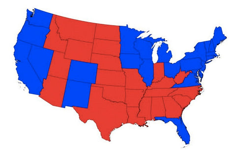
The standard USA maps showing red and blue fill states is a very misleading image because it conveys the physical size of a state, not it's electoral value. Yet the map is presented over and over again in the media.

Greg Miller, at National Geographic, takes a stab at improving the map graphics used to portray election information. Greg uses the cartogram, in which the shape of each states is distorted to reflect the number of electoral votes they have.

Read Greg's article at National Geographic.
Even more election map info from Greg here.
Share this post
0 comment
